Houzz Rebrand
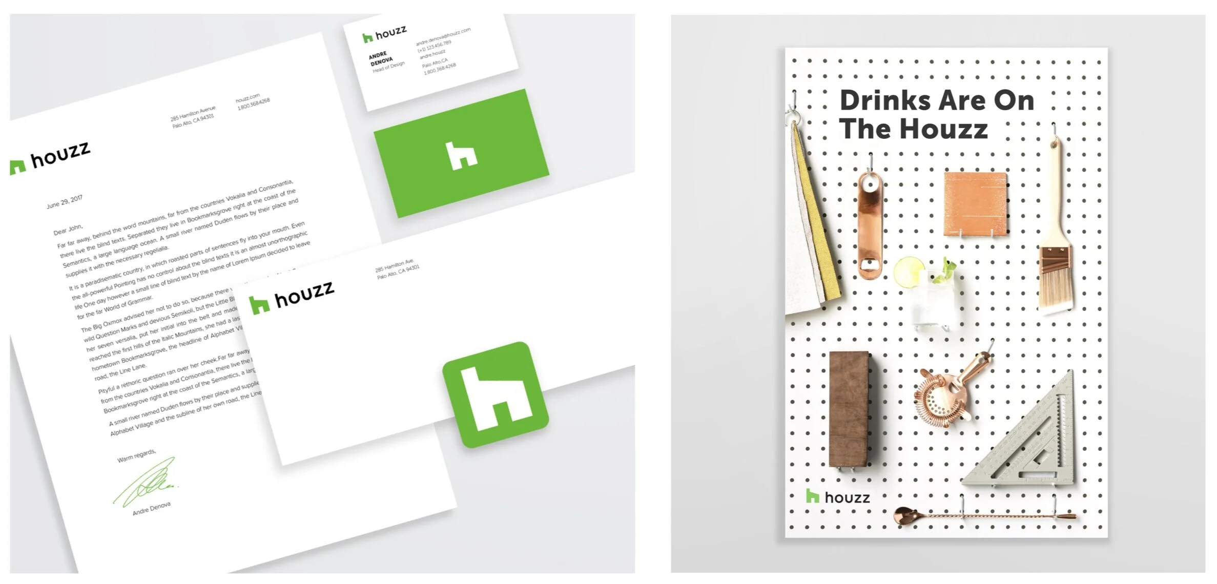
In 2018 we partnered with studio Pentagram to redesign the Houzz logo. Our goal was to create a simplified and clean look that best represents us as the only place where people can find everything to design or renovate their home, from inspiration to products to home professionals. We wanted our logo to be warm and to clearly communicate home, while keeping the ‘h’ and the word ‘Houzz’ recognizable. To complete the redesign, our in-house brand design team expanded the logo into a full brand book that included detailed visual language of typography, illustrations, iconography, colors, girds, and marketing collaterals.
Year: 2018 / My Role: Head of design
The New Logo Story
Brand Style Guide
We’ve created a detailed guideline for all the elements that make the Houzz brand, and outlined the proper way to use them.
Our goal was to To preserve the integrity of our identity and ensure that both the Houzz mark, logotype, and visual elements are always recognizable legible, and stand out.
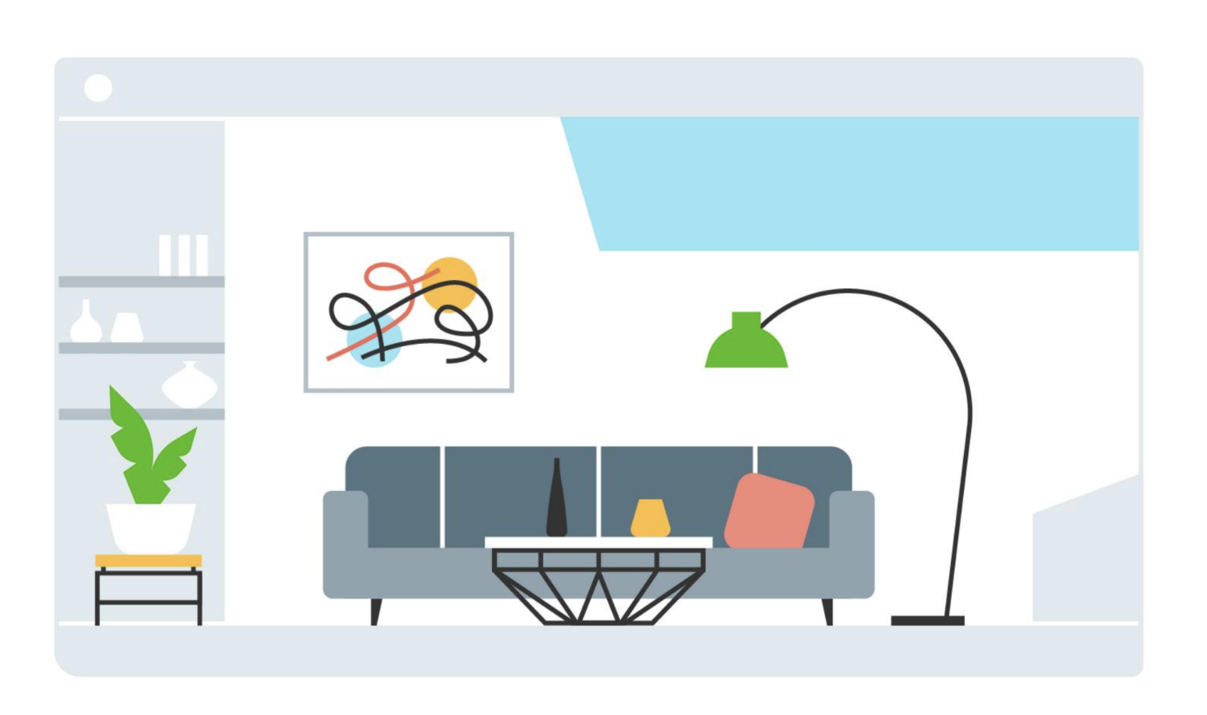
Icons and Illustrations
We’ve created over 100 costume tier 1 and tier 2 icons
